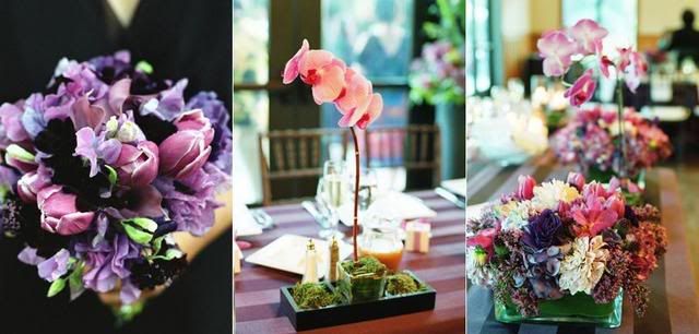
Everyone has already seen
Nancy's unique floral designs in
Lisa Wong Jackson's wedding. Her
online portfolio is equally inspiring- we especially love the flowers from her
Caffe Viola color story. We find it so much more fun to browse florists' sites when they are organized by either wedding event or color palette. What do you think makes a good vendor website? I think a lot of vendors in the wedding industry (florists, photographers, cake designers, etc.) could benefit from better designed websites- is a good website a factor for you when making the decision to use someone or not? Just curious- Faye didn't seem to mind when a website was totally worthless, but a well-designed website and easy-to-navigate portfolio were a huge plus in my book!
 {photos from Nancy Liu Chin Designs}


1 comment:
I believe that a website should be well-thought out and cohesive... it really gives me, as a consumer, an idea of who a vendor is--- I am a big believer that every front (from web to storefront to the little business card that you give me) needs to be an extension of who you are and what your services are... if I am not confident in your ability to showcase yourself.. then I will not be confident that you can showcase my vision either.
Post a Comment